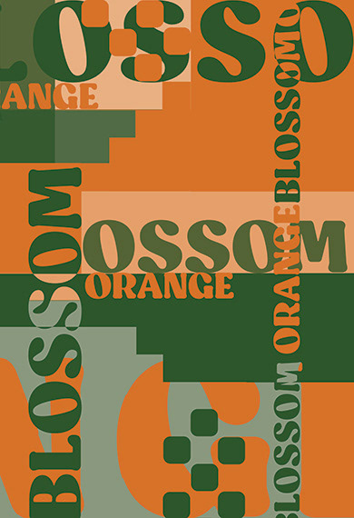
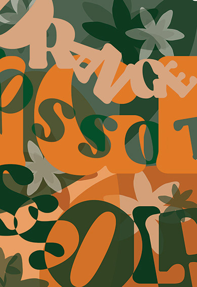
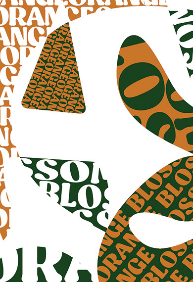
This typographic poster series was created for a Typography course, with the objective of exploring three distinct compositional approaches: grid-based design, abstraction, and the use of negative space. Using the phrase “orange blossom,” chosen for its visual and conceptual flexibility, I crafted each poster to highlight different aspects of typographic structure and expression.
The phrase also provided an opportunity to incorporate two of my favorite colors, orange and green, resulting in a vibrant yet balanced color palette across the series. Each piece demonstrates a unique interpretation of type as both form and message, while maintaining thematic consistency through color and phrase.